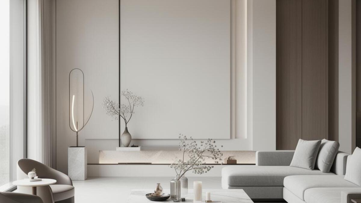

Luxury is a language of omission. Every unnecessary element removed is a signal: we have the confidence to leave things out. The palette narrows. The typography slows down. Textures become tactile and earned. This is not minimalism for its own sake but restraint as an expression of sufficiency. True luxury visuals never announce themselves. They let the viewer arrive at the conclusion alone.
Visual styles that communicate this
When to use this visual mood
- Premium product launches where price anchoring is part of the strategy
- High-end hospitality: hotels, restaurants, private members clubs
- Luxury fashion and fine jewelry campaigns
- Premium spirits, wine, and specialty food
- Wealth management, private banking, and financial services
- Executive portraiture and corporate identity for C-suite positioning
- Real estate at the top of the market
What to avoid
- Bright saturated accent colors that read as promotional
- Decorative flourishes that feel added rather than integral
- Busy compositions that compete for attention
- Typographic hierarchies that feel urgent or sales-driven
- Stock imagery that shows obvious happiness
Industries and use cases
FashionHospitalitySpirits and wineJewelryAutomotiveReal estateFinancial services
Related moods
About this mood
Generate visuals in the luxury register
Elio reads your visual references and generates in your exact aesthetic. Drop in images that carry the right mood and it extracts the DNA automatically.
Join the waitlist